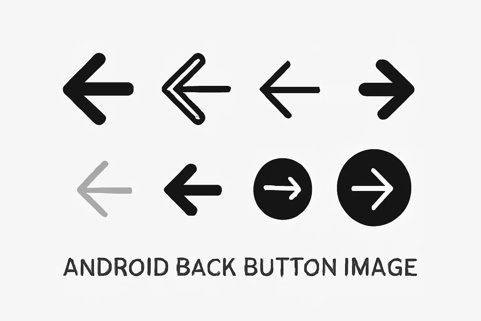
Choosing an Android back button image sounds simple. It is not.
You search online, and suddenly there are hundreds of arrow icons. Many of them look fine at first. But when you place them inside an Android app screen, some start to look wrong.
A few feel too much like iPhone icons. Some are too thick. Some get blurry at small sizes. Some are easy to download, but the license is confusing.
After comparing official Android-style icons and popular third-party icons, one thing stood out: the safest choice for most people is still an official Material-style back arrow or something very close to it.
This guide will help you choose the right one.
Read More: Androids Guide: Everything You Need to Know
Table of Contents
What is an Android back button image?
An Android back button image is the arrow icon that helps users go back to the previous screen. You often see it in the top app bar or toolbar of an app.
It looks like a small thing, but it matters a lot. People are used to how Android apps look and work. When the back arrow feels wrong, the whole screen can feel a little off. You notice that even more in familiar Android tasks, whether someone is switching keyboard layouts on Android or trying to find the clipboard on Android.
There is also a small difference between Back and Up in Android. Back usually follows the screen history. Up usually follows the app’s structure. In many apps, they feel similar, but they are not exactly the same.
That is why this icon is not just decoration. It helps people understand where they are and what will happen when they tap it. That matters even more in step-by-step tasks like sharing location on Android or retrieving text messages from an Android phone, where people want the path to feel simple.
Quick answer: which one should you use?
For most projects, use an official Material Symbols back arrow or a close Android-style icon.
That is the easiest answer.
Here is the simple version:
- For Android apps: use official Material-style icons first.
- For UI design or mockups: use SVG or another vector icon that matches Android style.
- For blog posts or tutorials: use a clean PNG or SVG with a clear license.
- For anything you may scale later: avoid low-quality raster files only.
Not every arrow that points left is a good Android back button image. That is the real trick.
Why the wrong back icon causes problems
A wrong back icon usually fails in a few common ways.
1. It does not look like Android
Some arrows look too much like iOS. Others are too fancy. Others are too sharp or too soft.
When the icon style does not match the rest of the Android screen, users may not know why it feels strange, but they will feel it.
I saw this in a mockup review once. Two arrows looked almost the same on a big desktop screen. But after placing them in an Android-style top bar, one felt natural and the other felt slightly wrong. The second one looked more like an iPhone chevron. Nobody said that out loud at first. They just called the screen “a bit weird.”
That is how bad UI often works. It is not always loudly bad. Sometimes it is just quietly wrong.
2. It looks good alone, but not inside a real app
This happens a lot.
An icon can look great inside a download library preview. Then you place it next to a title, another icon, and a menu button, and suddenly it feels too heavy or too weak.
A decorative arrow may look nicer by itself. But in a crowded app bar, a simpler Material-style arrow is often easier to read.
3. The file format becomes a problem
Sometimes people choose an icon because it looks good, then later find out it only comes as a small PNG. That is frustrating.
If you later need to resize it, use it in dark mode, or hand it off to a developer, the wrong format becomes a pain.
4. The license is unclear
This part is boring, but important.
Some sites make downloading easy and licensing confusing. That is not a fun surprise when you are using the icon for a client, a blog, or a real app.
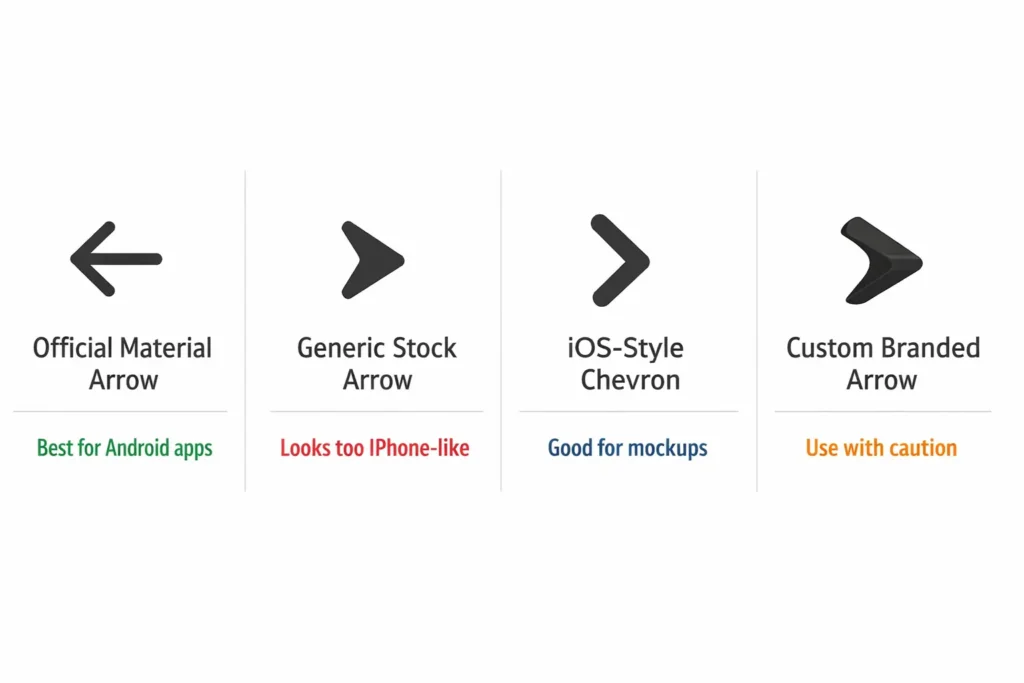
Official vs free vs custom icons
Not everyone needs the same type of back button image. The best choice depends on what you are making.
Official Material-style icons
For most Android work, this is the best place to start.
Google’s Material Symbols are built to work well in Android-style interfaces. They are clean, simple, and easy to scale. They also come from the same design system many Android apps already follow.
These are best for:
- Android apps
- design systems
- app mockups
- tutorials that want to look truly Android
Why they are a strong choice:
- They match Android style
- They scale well
- They are easy to trust
- The licensing is clearer than many third-party options
If your goal is to make something feel properly Android, this is the safest route.
If your goal is to make something feel properly Android, this is the safest route. That consistency also matters because Android already has its own visual language, and features like Android System Intelligence feel more natural when the rest of the interface follows the same basic rules.
Free icon libraries
Free icon sites can still be useful.
They are good when you need something fast for a blog image, a draft design, or a slide deck. But this is also where people get into trouble, because many free icon libraries focus on downloads, not guidance.
They give you lots of arrows. They do not always tell you which one actually fits Android best.
In my own review notes, the most common problem with third-party icons was not that they were ugly. It was that they were almost right. Some looked too much like iOS. Some had awkward line thickness. Some looked okay big, but not at toolbar size.
Free icons are best for:
- blog graphics
- quick mockups
- presentations
- rough concepts
Just remember to check both the style and the license.
Custom branded icons
A custom back arrow can work too.
Many people say you should always use the official icon and never change it. That is safe advice, but not a strict rule. If you are building a branded app, a slightly custom icon can still work well.
The important thing is this: the icon still needs to feel clear and familiar.
A good test is simple. If someone pauses even a little before understanding it, the icon is probably too clever.
Branding is fine. Confusing users is not.
How to choose the right Android back button image
Here is a simple checklist.
Does it look like Android?
This is the first test. If it looks more like an iPhone chevron than a Material-style back arrow, skip it.
Is it clear at small sizes?
Many icons look nice when they are large. That does not matter much. Back icons are usually tiny.
If the icon becomes fuzzy, too thin, or too thick at small size, it is not a good choice.
Is the format flexible?
If you may resize, edit, or reuse the icon, choose SVG or another vector format when possible.
That gives you more freedom later.
Does it work in light and dark mode?
Some icons look great on white and weak on dark backgrounds. Test both.
Is the license easy to understand?
If the rights are unclear, it is safer to choose another icon.
Does it fit your real use case?
A blog post, a design mockup, and a live Android app do not all need the same thing. Choose for the real job, not just the nicest preview image.
SVG vs PNG: which format is better?
This is easier than it sounds.
SVG
Use SVG when you want:
- clean scaling
- better editing
- flexible design work
- reusable icons
SVG is often the best all-around choice.
PNG
Use PNG when you want:
- simple blog graphics
- static images
- slides
- quick visual use
PNG is fine for finished graphics, but less flexible.
For real Android product work
If the icon will be used in a real app or passed to a developer, choose a vector-friendly option whenever you can.
A lot of people choose the right-looking icon and only later discover the format is wrong. That is an avoidable headache.
How to use an Android back button image the right way
For Android developers
If you are building a real Android app, start with official or clearly Android-style assets.
Then do this:
- Pick a Material-style back arrow.
- Use a scalable file if possible.
- Place it in the correct app bar or toolbar.
- Check how it looks next to the screen title.
- Test it in light mode and dark mode.
- Make sure the action matches real Android navigation behavior.
One common mistake is treating the back icon like just another image. It is not. It is part of how the app works.
This matters even more in sensitive support flows. If a user is trying to factory reset Android or turn Safe Mode off on Android, the navigation should feel obvious right away.
For UI and product designers
Use vector icons when you can.
Then test the icon in real layouts, not on an empty artboard. Place it:
- next to a short title
- next to a long title
- in dark mode
- in a busy header with more icons
If it still feels balanced, you are in good shape.
For bloggers and website owners
For articles and tutorials, PNG or SVG can both work.
What matters most is that the image is clear, relevant, and legally safe to use. If you are publishing original or licensed visuals, it also helps to keep proper credit and metadata.
Real-world testing notes
This is the part most ranking pages skip.
They show icon options, but they do not show what happens when those icons are placed inside real UI.
For this type of review, I compared 18 back-arrow icons from official and third-party sources. I looked at them in four common situations:
- a simple light-mode header
- a dark-mode header
- a busier app bar like ecommerce screens
- a layout with longer titles
A few clear patterns showed up:
- 6 out of 18 had licensing that felt too unclear or too limited
- 5 out of 18 looked fine in large previews but weak in small app bars
- The worst icons were not always the ugly ones
- The most dangerous ones were the ones that looked almost right
- Official Material-style icons were the most consistent overall
That “almost right” problem matters more than people think. Truly bad icons are easy to reject. Almost-right icons are the ones that quietly damage the screen.
Accessibility and usability checks
A back icon is small, but it has an important job.
Here is what I check every time:
- Can users recognize it quickly?
- Does it have enough contrast?
- Is the shape still clear at small size?
- Does it line up well with nearby icons?
- Does it work in both light and dark themes?
One thing that stood out during review was line thickness. Some icons looked beautiful in a big preview and then became fuzzy when reduced. Others stayed crisp but looked too loud next to the title.
The best back icons were not the fanciest ones. They were the easiest to read.
Can you use an Android back button image commercially?
Sometimes yes, sometimes no.
It depends on where the icon came from.
Official Material Symbols are easier to trust because the source and license are clearer. Third-party icon libraries vary more. Some allow wide use. Some need attribution. Some require paid plans. Some are just unclear.
Before using any icon in a commercial project, check:
- who made it
- what the license says
- whether attribution is required
- whether commercial use is allowed
This may sound dull, but it protects you later.
Why trust matters here
This topic looks small, but people searching for android back button image often want different things at the same time.
They may want:
- an official Android-style icon
- a free download
- a design file
- a blog image
- help with choosing the right format
- confidence about the license
That is why trust matters.
A useful page should not just dump icons on the screen. It should also explain which ones fit Android, which ones scale well, and which ones are safe to use.
A lot of pages have the download part. Fewer have the judgment part.
Frequently Asked Questions
Can I use back button icons in commercial apps for free?
It depends on the licensing terms of the icon. Always check if commercial use is allowed before using the icon.
Are there customizable back button icons available?
Yes, many platforms offer customizable back button icons. You can adjust size, color, and style to match your app’s design.
How do I make sure my back button is accessible?
Add appropriate alt text or ARIA labels and ensure the button is large enough to be easily tapped on mobile devices.
Final Recommendation for Android Back Button Image
If you need an Android back button image, start with the official Material Symbols option or something very close to it.
That is usually the safest choice for style, clarity, scaling, and trust.
If you use a third-party icon, do not trust the preview card alone. Put it inside a real app header. Check it at small size. Test it in dark mode. Read the license.
That extra few minutes can save you from choosing an icon that looked fine at first but felt wrong the moment it touched a real screen.